 how-to
How to Choose Unique Illustrated Sweaters
Table of Contents
- Understand Sweater Construction Methods
- Measure Your Body and Understand Ease
- Select the Best Materials for Graphic Sweaters
- Evaluate Design, Texture, and Illustration Quality
- How to Style Illustrated Knitwear for Different Body Types
- Care for Printed Sweaters to Preserve Design and Quality
- Sustainability and Ethical Sourcing in Illustrated Knitwear
- Frequently Asked Questions
Last Updated: September 27, 2026
Understand Sweater Construction Methods
Sweater construction affects fit, durability, and how illustrations display on your body. Two main methods dominate: bottom-up versus top-down knitting, and seamless versus seamed designs.
Bottom-up vs. top-down knitting
Bottom-up construction starts at the cuff and works upward; it's traditional but offers less fit control. Top-down knitting begins at the neck and works downward, allowing you to try the sweater on mid-project and adjust sizing.
Seamless versus seamed construction
Seamless sweaters are knitted in one continuous piece with no side seams. Seamed sweaters are knitted in separate panels and stitched together.
Measure Your Body and Understand Ease
Fit determines whether an illustrated sweater becomes a favourite or sits unworn. Two measurements matter: your body size and the garment's ease.
Taking accurate measurements
Measure yourself wearing a fitted shirt. You'll need: chest (around the fullest part), waist (at your natural bend), shoulder width (point to point across the back), and sleeve length (centre back neck to wrist). Stand relaxed, don't pull the tape tight, and compare to the sweater's size chart before purchasing.
How garment ease affects fit
Ease is the difference between your body measurements and the sweater's measurements. Standard ease (5-8cm) creates a comfortable everyday fit; negative ease (0-2cm) is fitted; relaxed ease (10-15cm) is loose and oversized.
Select the Best Materials for Graphic Sweaters
The yarn and fibres you choose determine how the sweater feels, how long it lasts, and how the illustration holds up through washing and wearing.
Yarn weight and fiber content
Yarn weight describes thickness. Heavier yarns create thicker, warmer sweaters; lighter yarns produce drapier, more breathable pieces.
Natural fibres have distinct properties: wool is warm and elastic; cotton is breathable but stretches; linen is cool and durable.
How textile quality affects durability
Quality yarn holds shape and resists pilling and fading. Check for consistent thickness, tight twist, minimal fuzzing, and smooth colour. Run your hand across the sweater, quality fabric feels smooth and substantial; cheap fabric feels thin, fuzzy, or rough.
Evaluate Design, Texture, and Illustration Quality
An illustrated sweater's success depends on how well the artwork integrates with the knit structure. The illustration must be bold enough to read from a distance, detailed enough to reward close inspection, and durable enough to survive regular wear.
How knit texture affects illustration readability
Stitch patterns affect illustration readability. Ribbed texture frames or fragments designs, simple, bold designs work best. Chunky knit requires strong contrast. Cabled patterns distort illustrations unless large and simple. Smooth stockinette stitch is ideal for detailed, intricate illustrations.
Design placement and scale on the body
Centred chest designs draw attention to the torso; off-centre designs create movement. Wraparound designs make bolder statements. Scale matters, ask retailers for design measurements, not just garment size. Ensure artwork sits cleanly within panels and doesn't cross seams where prints might crack.
Hand-drawn versus digital illustration techniques
Hand-drawn illustrations carry personality but can be inconsistent across production runs. Digital designs offer precision and consistency but may feel more commercial. Some brands blend both: hand-drawn artwork scanned and refined digitally, combining personality with consistency.
Print method and durability
Inspect print edges for sharpness, even colour saturation, and no cracking or peeling. Run your fingernail lightly over the design, quality prints feel smooth and integrated; poor prints feel raised, plasticky, or rough.
How to Style Illustrated Knitwear for Different Body Types
An illustrated sweater that fits perfectly still needs to be styled thoughtfully to let the design enhance rather than compete with your frame. The right styling choices amplify the artwork and create visual balance.
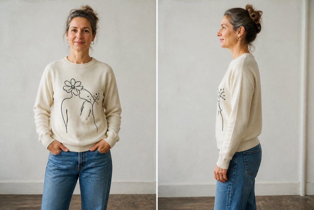
How illustration scale affects perceived body proportions
Design size influences how your body appears. Large illustrations (40%+ of chest) draw the eye; medium (20-35%) work across most body types; small (under 20%) suit petite frames. Ask retailers for design dimensions in centimetres and compare to your torso measurements.
Vertical versus horizontal design elements and visual elongation
Vertical designs (tall, narrow illustrations or designs with strong upward lines) create the illusion of height and elongation. They work well for:
- Shorter frames that benefit from visual lengthening
- Wider frames where vertical lines create a slimming effect
- Athletic builds where vertical elements add visual interest without bulk
Horizontal designs (wide, squat illustrations or designs with strong sideways lines) add perceived width. They work well for:
- Taller frames where horizontal lines break up length
- Narrower frames where horizontal elements add visual substance
- Designs meant to emphasise the shoulders or chest
Asymmetrical or diagonal designs create movement and visual interest. They're particularly effective for curvy builds because they guide the eye along the body's natural lines rather than emphasising width or narrowing it.
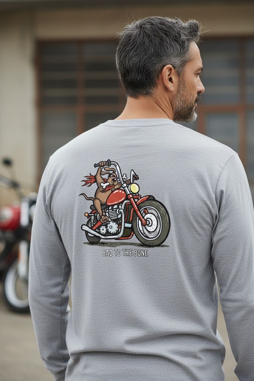
Bone To Pick Dog Sweater | Dog →
Consider the design's orientation before purchasing. A tall, narrow illustration of a bird or plant creates different visual effects than a wide, horizontal landscape or abstract pattern.
Centred versus off-centre design placement
Centred designs (positioned directly on the chest) draw attention to the torso and create a focal point. This works well if you want to emphasise or balance your upper body. On curvy frames, a centred design can emphasise the chest. On athletic frames, it adds visual interest to a flatter chest.
Off-centre designs (positioned to one side or asymmetrically) create movement and visual flow. They guide the eye along the body rather than stopping at a single point. This works well for:
- Pear-shaped frames (wider hips) where off-centre chest designs draw attention upward
- Apple-shaped frames (wider torso) where side-positioned designs create visual balance
- Any frame where you want to avoid a static, centred focal point
Wraparound or all-over designs (extending to sleeves, back, or sides) make a bold statement and distribute visual weight across the entire garment. These work well for larger frames where a single centred design might feel too small, and for anyone who wants the illustration to be the dominant visual element.
Styling choices that enhance illustrated designs
Once you've chosen an illustrated sweater suited to your frame, styling amplifies or diminishes its impact.
Pair with simple bottoms. Let the sweater be the focal point. Plain jeans, neutral trousers, or simple skirts allow the illustration to command attention. Busy patterns or bold colours in bottoms compete with the design.
Avoid competing accessories. A bold necklace, patterned scarf, or statement bag fights for visual attention. Keep jewellery minimal and colours neutral. Let the sweater's illustration be the statement piece.
Consider layering carefully. An open cardigan or overshirt can frame an illustrated sweater beautifully, especially if the layering piece is a neutral colour. Avoid layering that obscures the design. If the illustration is the reason you bought the sweater, don't hide it.
Match the sweater's mood to the occasion. A whimsical, playful illustration suits casual settings. A sophisticated, minimalist design works for professional environments. A bold, artistic illustration makes a statement at social events. The context matters as much as the design itself.
Use the illustration's colour palette for guidance. If the design features warm tones (oranges, reds, yellows), pair it with warm-toned bottoms or accessories. If it's cool-toned (blues, purples, greens), echo those tones elsewhere. Colour harmony makes the entire outfit feel intentional.
The goal is to create a visual hierarchy where the illustrated sweater is the star and everything else supports it.
Care for Printed Sweaters to Preserve Design and Quality
An illustrated sweater is an investment. Proper care extends its life and keeps the design looking sharp for years.
Washing and drying techniques
Wash printed sweaters inside out in cold water. This protects the design from friction and fading. Use a gentle cycle and mild detergent. Avoid bleach and fabric softener, which damage both the print and the fabric.
Preventing fading and print cracking
Sunlight fades both fabric and print. Store sweaters in a cool, dark place away from direct sunlight. A drawer or wardrobe works better than a sunny shelf.
Sustainability and Ethical Sourcing in Illustrated Knitwear
Increasingly, people care about where their clothes come from and how they're made. Illustrated sweaters sourced ethically and sustainably align your values with your wardrobe.
Frequently Asked Questions
How can you tell if an illustrated sweater design is high quality?
Look for crisp, detailed artwork that hasn't started to crack or fade. High-quality illustrated sweaters feature hand-drawn designs with clean lines and vibrant colours. Check the seams for even stitching and secure construction. Feel the fabric weight, it should feel substantial without being stiff. Read customer reviews mentioning durability, and examine close-up product photos to assess print clarity and texture detail. Brands with design heritage, like those with 30+ years of experience, typically maintain higher standards for both artwork and garment integrity.
What's the best way to care for printed sweaters to prevent fading?
Turn your sweater inside out before washing to protect the design. Use cold water and a gentle cycle, avoiding hot water that can damage both the print and fibres. Wash with similar colours to prevent colour bleeding. Air dry flat rather than using a tumble dryer, which can cause print cracking and shrinkage. Avoid direct sunlight when drying. When storing, fold rather than hang to reduce stress on seams. These steps help printed sweaters maintain their design integrity and colour vibrancy for years.
Are graphic sweaters still in fashion for 2026?
Yes, illustrated and graphic sweaters remain on-trend, particularly those with original, hand-drawn artwork and retro-inspired designs. What's evolved is the emphasis on quality, consumers now prioritise well-constructed, durable pieces with unique designs over mass-produced graphics. Statement sweaters with humorous, thoughtful artwork appeal to those seeking personality in their everyday wear. The key is choosing designs that feel authentic and artistic rather than trying too hard, ensuring your sweater remains stylish and wearable across seasons.
What materials work best for illustrated graphic sweaters?
Look for high-quality materials that offer good drape and durability. Avoid overly thin fabrics, which won't hold prints well or last through repeated washing. Check yarn weight, medium to heavy-weight yarns support detailed illustrations without pilling.
Choosing an illustrated sweater means balancing design, quality, fit, and durability. You want a piece that makes you smile every time you wear it, feels comfortable, and holds up through regular washing. At Baaaad Flockers, we create hand-drawn sweater designs backed by 30+ years of design experience. Our sweaters are crafted for excellent fit, superior comfort, and designs that spark genuine joy. Explore our collection and discover an illustrated sweater that's uniquely yours.